

 The introduction of smartphones and tablets has revolutionized the way people access information. Internet users are accessing websites using everything from 70" televisions all the way down to mobile devices. Every single one of your visitors needs an experience that is optimized for their specific device. As a result, the use of responsive web design services has increased dramatically.
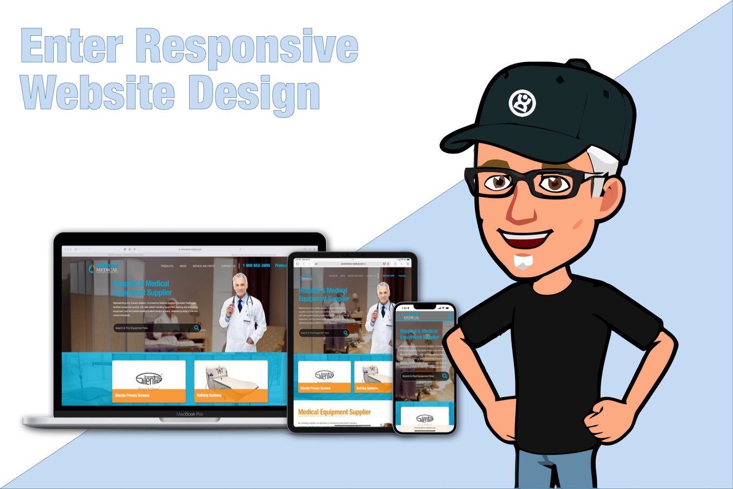
Responsive design is a pretty straight-forward concept. It simply means the design of the website 'responds' to the specific environment (or device) it's being viewed on. This means the layout is styled differently for someone using an HD monitor as opposed to someone using a mobile device, such as your smart phone or a tablet. With this approach we use one layout, one set of files, and one set of content. The only difference is that when the website is opened it first identifies how it's being viewed (i.e. type of device) and then serves up specific viewing 'rules' that we have laid out for the resolution of that device.
Doncor.com was not only in the top 1% of web designers to introduce responsive website design to the Niagara Region, but we were also instrumental in introducing the first responsive content management system ever developed.
But What About Mobile-only Websites?
Before responsive website design became the new standard, mobile websites were gaining a lot of popularity because of the iPhone. Visitors were now accessing websites using their desktop and mobile phone. At the time it seemed only logical that you would not want to give someone using an iPhone the same website as someone sitting at a desk, because the perspectives and resolutions were very different between the two devices. So, many companies invested in a second site, which had the same content, but a slightly different URL address. Basically, it was twice the cost and twice the work.
Then things changed again. We suddenly had more contenders come to the table. iPads and televisions are now being used just as much as these other devices and all with varied screen sizes and resolution. While there is still a small market for mobile-only websites, Responsive Design is the only way that you can provide visitors with an enjoyable experience across all these devices.
Mobile accounts for approximately half of web traffic worldwide. In the fourth quarter of 2021, mobile devices (excluding tablets) generated 54.4 percent of global website traffic, consistently hovering around the 50 percent mark since the beginning of 2017 before consistently surpassing it in 2020.Jan 12, 2022
See Responsive Design in Action!
Not sure how it all works? Seeing is believing – grab the corner of your browser right now and scale this window to a narrower size. Like magic you will see the layout respond to the change. Even better, grab your smartphone or tablet and give it a shot.
Let's chat about responsive design!
Talk with a pioneer in this industry and get a solid understanding instead of some pat answer. Give us a call (905) 714-9222 and, Yes! We do have time for your call. If you prefer to use the form below to send us a message, we'll be getting back to you quickly with answers to your questions about responsive website design.